
Here’s my final painting for this exercise. It’s an abstract representation of honeysuckle growing through wrought iron. This is a brand new direction for me, and I had fun doing it. I could have made 20 equally striking images from the close up photos I took, and developed through sketchbook work. The subject became more and more appealing as I worked, and discovered its potential I’m pleased with the outcome, although I would have liked elements of my initial paper collage to have shown through in the final painting. I’m not sure if the green leaf is a distraction, though I liked the addition of this colour to the palette in the sketchbook.

I wandered around my garden taking photos of various flowers very close up. Back in the studio I looked at them all critically, for a subject that especially appealed to me. The one that stood out above the more exotic flowers was the honeysuckle. Apart from the interesting shapes of the flowers, I liked the creamy white buttery yellow colours contrasted against grey background, bright green leaf, and black shapes from the wrought iron fence. The combination of colours, tones, shapes and lines was striking.
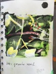
Starting to explore possibilities I made some A6 sketchbook studies in pencil, ink, watercolour and gouache.


The dramatic swathes of simple black shapes reminded me of the paintings of Franz Kline, seen here He projected some of his drawings on the wall and found they gained abstraction and expression when magnified,many continued to work in his way. His use of media is also exciting; some are done in black ink on cut and pasted telephone book pages mounted on paper then mounted on board.
But first I wanted to study the honeysuckle more carefully, and I looked closely and took some more photos and did some more investigatory sketches.

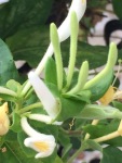
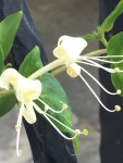
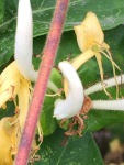

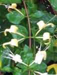


The flowers are attached to the stalk in tours of four, two on each side. New flowers at the tip of each stalk are creamy white; the older ones, those further back, buttery yellow. Each flower is accompanied by a pair of smaller leaves (sepals) as well as one larger leaf (I noticed there were sky-blue reflections on the wet leaves, in the rain). Each flower has 4 semi-joined parallel petals curling away from its leaves, and a single long petal curling towards the leaves. There are 5 stamens and one pistil (my failed A level biology coming back to me here!). Observing this closely reveals patterns and textural details which could be incorporated into a painting. Some of the photos are so magnified tiny ‘hairs’ can be seen along the edges of petals, variations in colour, spots and marks become apparent on the leaves.


The last sketch above uses ink and gouache resist; the second to last cut and pasted magazine print, gesso, ink, gouache and acrylic. I wondered whether there small sketchbook paintings would satisfy this exercise, but I think it’s all about scaling up – reproducing a drawing on a much larger scale as a means of abstracting, as Kline did.
Painting. Collage (cut and paste) magazine pages onto paper or board.

Realised I’d arranged them landscape way up, but decided it would add to the abstract nature to have the text on its side.
White Gesso added

Background now too light, flowers won’t contrast, so washed with dilute black ink.

Select composition. From my sketches I know I want to start with thick black marks, like Kline’s, in my background, inspired by the wrought iron. I know I love the combination of grey-black-white with white & yellow honeysuckle, and that the bright leaf-green plays a major part in the palett I want. I want simplicity of design, good contrast, strong negative shapes, not over-detailed crowdedness. By a process of elimination based on these criteria I decided to develop the sketch with curled black marks, echoing the curl of honeysuckle petals.


Black shapes added with acrylic paint instead of ink (first drawn roughly with charcoal) – in earlier exercise tryouts I discovered this gave me my blackest black. Scratched textural marks into it with the edge of a credit card.

Flowers sketched in, stamens added squeezing diluted pva glue through a nozzle.

Strengthen the flower colour, paint the yellow anthers and green stigma, add a green leaf shape. I felt there wasn’t enough contrast between the petals and grey background, so added a wash of ink to darken the grey, then scattered salt to absorb pigment creating texture in the background. By now my magazine print has all but disappeared, which is a shame as some of the pieces were specially chosen for their textual content and graphic interest.

Finally I softened the yellow colour in the petals, removed the salt, drew some white marks and spatters in the black areas, added small touches of red.

References
