Category Archives: 2.1 Understanding colour

2.1.1 mixing greys – an achromatic scale


211.jpg 


After a few poor attempts at producing a smoothly graded anachronistic scale in black and white, I started to get a better outcome, finally ending with quite a reasonable scale.  Mixing the tones, I realised that with care a great deal of accuracy is achievable. Too often in the heat of making a painting, I mix my colours quickly and I usually make do with a result more or less far away from the colour I really want. 

The midtone scraps of paper placed at either end of the Middle scale above, are exactly the same tone. However, the one on the left placed next to white looks noticeably darker than the one placed next to black, on the right hand end.  In fact I’ve noticed before that my phone camera actually records a tone as darker and a colour as more intense when placed next to a light tone / complementary colour. 

It’s good to be aware of this optical illusion when choosing tones and colours to place next to each other – if I want a big impact, for example to give the impression of an extremely bright tone, I should place a very dark tone next to it rather than a less bright tone – this is what I was looking for in my Part 1 assignment piece, and could now go back to try it out on the leaves which should have been ‘glowing’ with light.  Similarly, if we want a colour to look extremely intense, place it next to its complementary to make it sing out. 

2.1.2 primary & secondary colour mixing

In my acrylic paintbox I have a small range of colours but in several different makes, so as well as learning about the colours I was looking forward to learning about the differences between make and quality of paint.

Having completed the exercise using the paint neat (ie no water added), my conclusion was that the more expensive paints were more intense and more heavily loaded with pigment – a little went a long way. By contrast the cheaper paints (System 3) seemed ‘thinner’ and to have poorer covering ability, needing two or three coats to get a pure, flat swatch. My Pebeo colours, although inexpensive, seemed quite reasonable quality, definitely worth continuing with for now. 

 Here are my exercises, notes, thoughts and reflections:-

Yellows 

212.jpg

It was immediately noticeable how transparent the Cadmiums were. Azo Yellow (W&N Finity Artists ) was easily the most intense. The Rowney Cryla was extremely thick and could hardly be used without dilution. I put a second coat on all – B and C were still transparent, even with a little white added, and needed 3 coats to cover the grey ground. 

Hue – Process Y and Lemon Y were similar – quite cool. Cad Y were warmer, while Azo Y is between the two

Chroma (intensity) – the Cads were the least intense, most intense were Process and especially Azo. (but Process needed a couple of coats to build up to the same intensity).

Tone (light or dark) – the Cads are darkest in tone – especially Cad Yellow Hue, but this is because of the grey ground showing through. Azo is the lightest. 

Changing the order of the colours –

Putting Cad Y Hue between Process and Azo revealed a big contrast between hue and intensity, with the Cad warmer and the other two much more intense by comparison. 

Cad next to Lemon also revealed quite a big difference in colour temperature.  


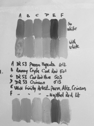
Reds – contrary to the course manual the Reds seemed more opaque than the yellows.  I did make a second set of colour swatches with a speck of white (DR S3 Tit White) added but it almost seemed to have the effect of making the colours more transparent. The Finity Artists white (bottom row) performed better than the S3. 


Hue – magenta and Aliz Crimson are fairly bluish-red. The Alizarin Crimson is almost purple. Napthol is more akin to the Cadmiums, warm with hint of orange. Crimson looked slightly bluish but not the rich colour I associate with Crimson. The colour most altered with the addition of white was the Crimson, which became a cool pink colour. 

Chroma – the Cryla Cad Red is easily the most intense, and Aliz Crimson also intense. Least intense is Cad Red Hue. 

Tone – Aliz Crim is very deep in tone, followed by Process Magenta. Lightest  are Cad Red Hue and Napthol Red Lt. 

Changing places –


I tried to compare opposites and thereby produce strong contrasts   Intersetingly, Magenta is light when applied as a single coat as above – the tone is the same as the Cad Red Hue its next to. 


Blues – 

Initial observation when I put the first row of swatches down was the very poor covering quality of the S3 ultramarine compared to the Finity Ultramarine next to it. Laying down the next row, mixed with white as suggested, I was amazed at how the colour of the Process Cyan was suddenly revealed. The S3 Ultramarine was a very poor colour still, tempted to throw it away seeing it here. 
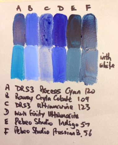
Hue – Process, Indigo and Prussian are greenish. Ultramarine and Cobalt are warmer blues. The pure hue of Process Cyan is brought out when white is added. Indigo with white is quite a murky hue. Cobalt with white is a sky blue, ultramarine is a much richer, deeper colour. 

Chroma – most intense is ultramarine. Cyan is also very intense, but needs white to bring out the colour. Cobalt and Prussian are less intense. 

Tone – indigo, Prussian and Cyan are very dark. Cobalt is lightest. 

Changing places – 


Cyan with white contrasted highly in tone with Prussian (AF).  A good colour temperature contrast would be Cyan with Ultramarine. 

 A lot depends on whether white is added and if so how much – tone can be infinitely adjusted. 


Best primaries – I identified the best, purest primary colours, two of them made by mixing with a speck of another colour to correct the balance – 


Scales –  

With my primary colours I carefully made some scales aiming to transition smoothly from left to right. 

At the beginning of the scales I only had to add a speck of the second colour to yellow to get the next hue. As I drew nearer the pure second colour I had to add increasing amounts of it to make a visible difference. 

The first two scales produced clear secondaries – orange and green – in the middle. The colour in the middle of the red-blue scale is murky brown, not purple or violet. I made mixes with cobalt and alizarin Crimson, and with magenta and ultramarine and compared these to my pure cobalt violet. 
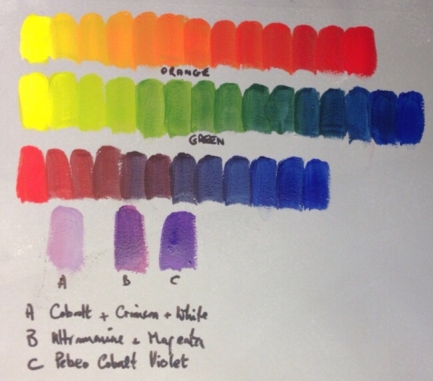
 

Scales, maintaining tone

This was difficult, even with the aid of a monochrome view on my phone camera, checking at each stage. 


The photos show that on the yellow to red scale I got slightly dark in the middle, but overall it was quite accurate. Yellow to blue got more noticeably dark in he middle, but I corrected this towards the end

Red to blue was the most difficult, and I can see by squinting at the original that the last three positions are too light. The photos don’t show accurately all the nuances of tone though – it’s important to realise the camera itself sees in a particular way. 


2.1.3 broken or tertiary colours

The colour mixes I made doing these scales include very varied and colourful greys, from warm purplish, to cool green-greys. It’s a good exercise producing these scales in a controlled and careful way. In the heat of making a painting my new knowledge will improve my il our selection and mixing  – instead of groping around for the shades I want on the fly. At the same time I’m improving my control of colour mixing, finding how to get the hue and tone I want, learning how much of this or that colour, or white, needs to be added. I’m also learning how to keep my acrylics wet and workable, and my brush and paints uncontaminated and clean. 

~~~~~~~~~~~~~~~

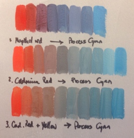
The scale between Naphthol Red Lt and Process Cyan produced purple-greys in the middle. I expected more of a greenish grey, as in the illustration in the course manual, so maybe Napthol red isn’t as orangey as I’d thought – it must be more of a cool, bluey red, like Crimson. 

 A second scale between Cad Red and Process Cyan produced warm, but more neutral greys in the middle – no element of purple. 

 A third scale using Cad Red with a touch of yellow added and Cyan produced a much cooler grey in the middle – and if I carried on making my red more orangey, this cool grey would eventually become greenish. 

Throughout, I adjusted tone with white paint, aiming for the same tone through my colour scales. The same photo converted to black and white showed my mistake – I’d started with the darker toned pure red, and created a scale to a lighter toned colour – so the tones get lighter instead of staying the same. This is less marked in the third scale where I used a red lightened with a little yellow as my starting point. 


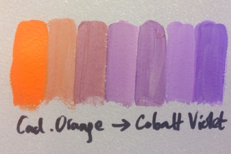
A scale from Cadmium Orange to Cobalt Violet came up with a yellowish grey in the middle (tho I can now see the 4th colour in the scale should have had more orange). 


2.1.4 complementary colours

I just made one colour wheel, aiming for Chevreul’s 72 colours, working methodically and slowly, placing the twelve basic colours first. I missed a few of the 72, misjudging space available within segments. Main problem was purples, which I initially tried to mix from my primaries, remembering just in time to use the cleaner ultramarine/magenta mix I’d discovered in the previous exercise. Another good exercise in careful colour mixing. 


Looking once more I can see a bit of a leap between my yellow and the next colour towards orange. The yellow-greens are a bit samey, these were the last colours I did, so maybe I was a little jaded by then. 


Next I took the twelve main colours and laid opposites (or complementaries) next to each other on a grey ground, then created a mix of each pair to create broken/tertiary colours.  In the previous exercise we mixed opposites too, creating a scale, with the tertiary colour in the middle (we also mixed near opposites, in my case orange and violet to get tertiary colours).


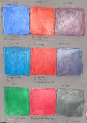
I used Sennelier oil pastels on 2 sheets of textured grey paper for this part of the exercise. An ordinary eraser turned out to be an excellent tool for blending my colour hatching and layering – a technique with possibilities for finished paintings, it can be used to produce interesting textures and colour variations.


After I laid down my six pairs of colours (twelve opposites in Chevreuls colour circle) in 7cm squares, using a blend of crayons where necessary, I checked and lightened the darker of each pair using a white crayon. The resulting mixes of each pair invariably had to be lightened too, as they were dark to almost black.

I would describe the tertiaries generally as ‘colourful greys’, but there were big differences between them. Yellow and purple yield a tan colour; blue and orange a mauve-grey which I labelled Heather; and red and green a neutral grey. The blends of two secondaries produced greys which I labelled Mink, Old Rose and Storm Grey.  When I appreciated these broken colours could be further varied by changing the proportions of the two colours in each pair, I realised the possibilities are endless.  But the charts I made using just the basic twelve colours give me a template to retain in my mind as an aid to mixing the exact shades I want.


Looking closely again at my pairs of complementary colours, the first thing I notice is that the contrast they produce when juxtaposed is very intense and eye-catching.  Particularly along the border where the colours meet, the brain perceives the red (for example) to appear redder and the green greener (I find it difficult to observe that in my charts – perhaps because my colour fields aren’t quite pure, flat colour).  This is Chevreul’s law of simultaneous contrast – the brain adds to the perceived hue a little of the complementary of the juxtaposed hue. So to the red the brain adds a little of the complementary of green, ie more red! This was expressed by Chevreul as follows; ‘in the case where the eye sees at the same time two contiguous colours, they will appear as dissimilar as possible, both in their optical composition and in the strength of their colour.’  


References

Chevreul’s Colour Theory and its Consequences for Artists, by George Roque, Pub The Colour Group Great Britain, 2011